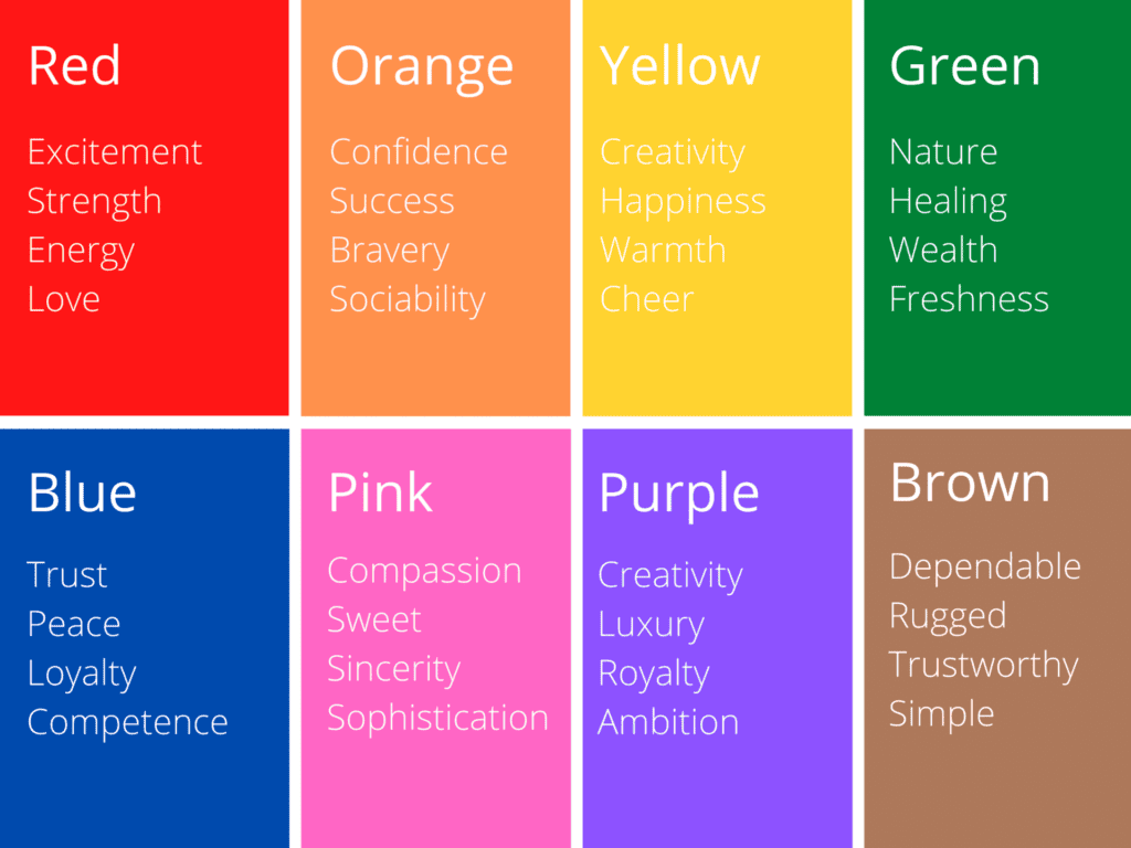
Color can signal many things. Blue can make people feel reassured. Green can make people feel calm. Purple shows creativity. Gray shows sophistication. Orange, red, and yellow convey energy and warmth.
Color is a tool you can use to start building your brand's image in a website visitor's mind before they read even a single word of your copy. Choosing the right colors and color scheme for your website gives you the opportunity to hook your customers from the moment the screen finishes loading.
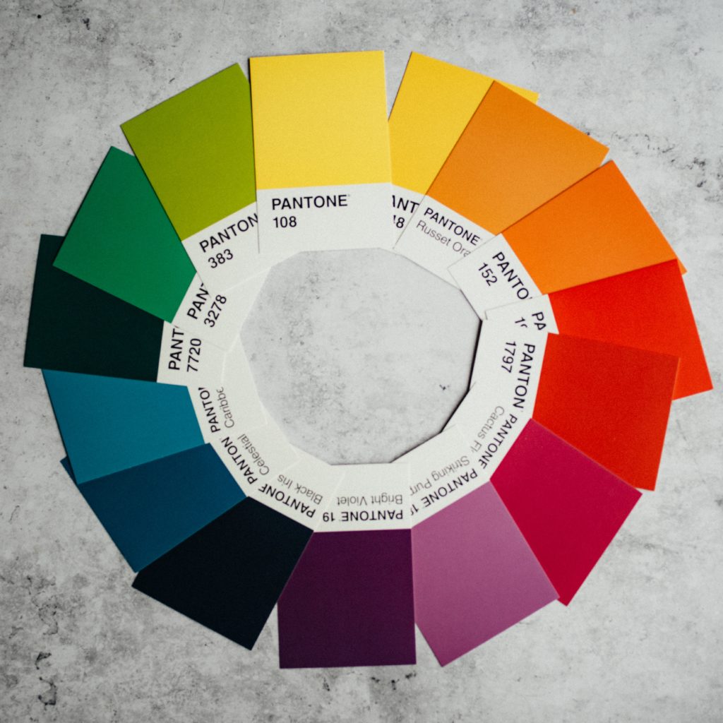
The collection of colors you choose for your website design is known as a "color scheme." These color choices can also be known as a "color palette." While color schemes and color palettes include more than one color, there is no cap to the number of colors that can be included.
(However, this is definitely a field where less is usually more. Potential customers can easily be overwhelmed by too many colors and will quickly move on to your competitors if they do not like the look of your website.)
The great thing about the colors you choose is that they can be used repeatedly for a variety of elements throughout your site. Not every element has to be a different color. That said, color schemes are usually divided into two sets: primary and secondary.
In this case, the term "primary colors" isn't talking about red, yellow, and blue. It's talking about the main colors that will be used for your site's background colors, logo colors, menu colors, and other dominant page elements. "Secondary colors" refers to the set of colors that are used as accent colors throughout the site.
When creating a color palette for your business website, it's important that it remains consistent across the site. This will help to reinforce your brand personality, something we talk about in our Blueprint for Online Excellence. Using the same colors over and over again helps to create associations and reinforce expectations between your brand and your audience.
What is the first thing you notice when a website finishes loading? Odds are it isn't the copy because, as powerful as copy is, it takes more than a millisecond for our brains to process the words we read. The first thing you notice when a website loads is color.
Studies have shown over and over that color has a major impact on how we feel and can influence how we think about a particular product, company, or brand.
But what does this mean for your website designs?
Research from the University of Winnipeg found two important things related to website color schemes:
Understanding color psychology and how your color palette impacts your visitors can lead to better website designs and visitors spending more time on your page leading to more leads.
Simple color schemes are more popular than ever. With more and more people using their mobile devices for web browsing, keeping colors simple but impactful is the best bet for resonating with your target audience.
Simple neutrals with bright text
Gray is seen as sophisticated. Muted earth tones are seen as grounded and calm. But if your palette is limited to those colors, some people can see it as boring. Adding in a bright, primary color as an accent color in your text is a way to direct attention to important elements while not overwhelming them with color.
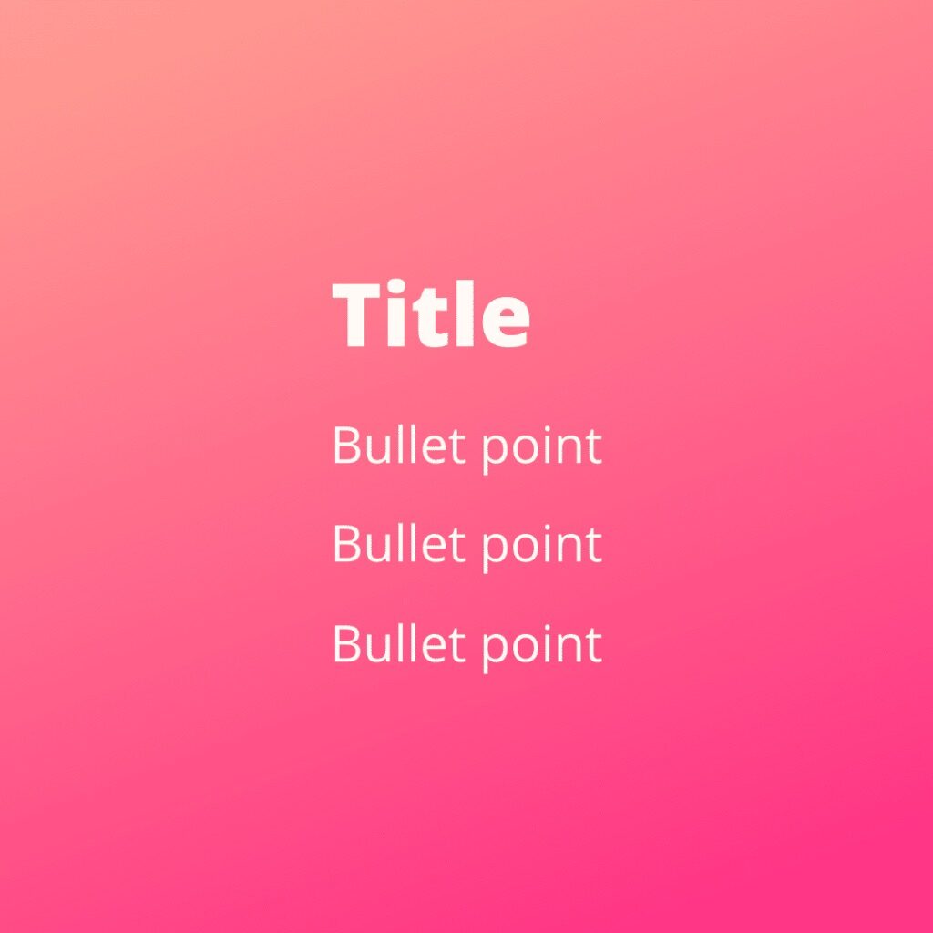
Color gradients with white text
Not every palette has to have multiple colors. Monochromatic color schemes can be just as powerful, especially if you use color gradients. Blending one main color creates a dynamic background that allows your text to jump off the page. It creates more texture in the background and makes your website much more interesting to look at for visitors.

Throwback tones
Everything old is new again, at least when it comes to popular color palettes. Designs that incorporate the neons from the '80s, rusty earth tones from the '70s, or the pop-art-inspired colors of the '90s are resonating with more people than ever before, especially if they are done in a modern way.
Adding in modern elements like color gradients or fading the colors to pastels is a great way to update these palettes for a more modern audience.

Muted tones with a bold color accent
Website visitors respond well to designs that incorporate muted tones and neutrals. They're easy on the eyes and make it easy to read any text. But designers can also effectively use a bright and bold primary color in these color schemes to draw attention to important elements like buy now buttons or contact forms.

Shades of a primary color accented by its complement
Using more than one shade of your palette's primary color is a great way to get a lot of mileage out of one color that may have meaning to your business. When you use a complementary color, you get a great contrast in your designs that draws the eye and looks great.
So how do you choose what colors you or your designers should use in your website designs? Not to sound glib, but there are just two steps.
1. Choose your primary colors.
The primary or dominant color in your website color palette is the anchor for your brand and should evoke the emotions you want your customers to associate with your brand. If you've already made a logo, the color that stands out the most should be the primary color for your website.
If you haven't made a logo yet, see the color psychology graphic above and use it when you think about what you want your customers to associate with your brand.
2. Choose your secondary colors.
This is the part where color theory comes into play. Color theory is what you learned in elementary school art class about how colors relate to one another on the color wheel. Designers use color theory to create designs that resonate with your audience. Here are the four most common color schemes:
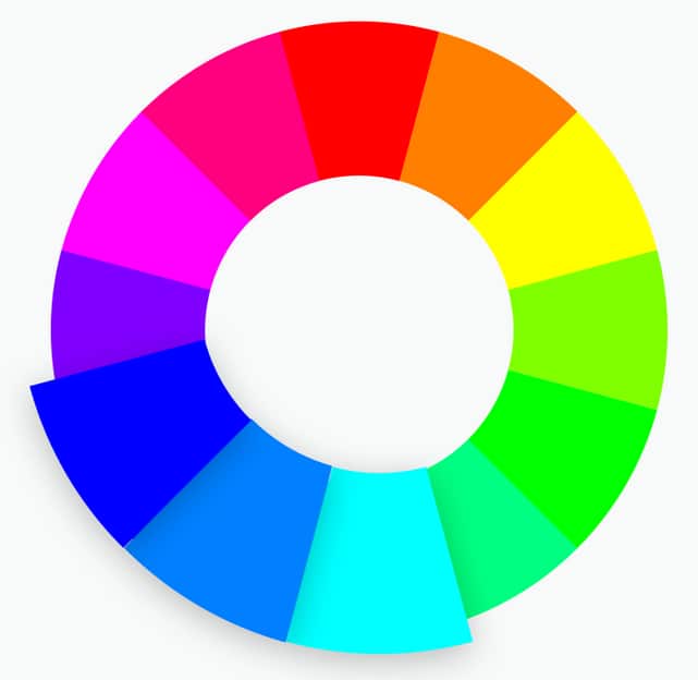
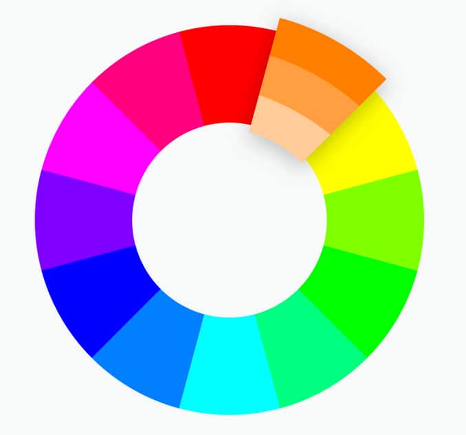
Analogous Color Schemes: Analogous color schemes use colors that are next to each other on the color wheel. These color combinations evoke a sense of harmony but it's important to choose just one shade as a primary color and use the others as accents.
Monochromatic Color Schemes: As mentioned before, these color schemes only use one color or shades of one color. Using just one color can make it harder to evoke an emotional response but it does communicate authority and stability.
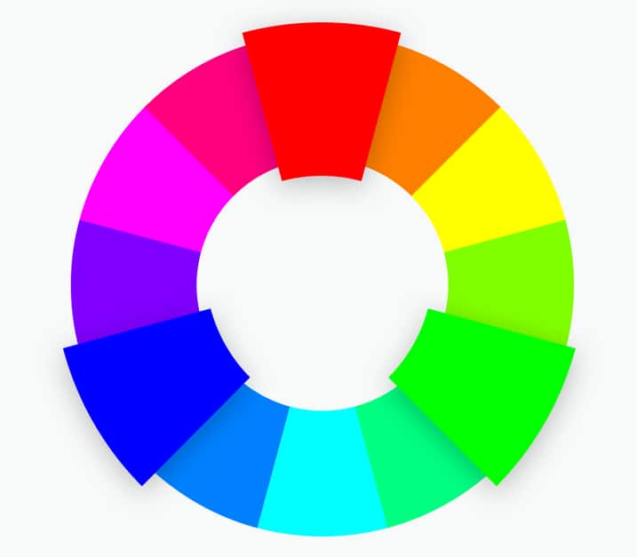
Triadic Color Schemes: Where monochromatic color schemes use one color, triadic color schemes use three that are evenly spaced around the color wheel (think orange, green, and purple). These tend to be bold, dynamic color schemes, even if you use pale or unsaturated versions of the colors.
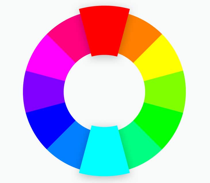
Complementary Color Schemes: Complementary colors are those that are opposite one another on the color wheel. These color combinations can be very attention-grabbing, but also jarring and unpleasant for the viewer. Use them carefully.
If you need a little help narrowing down colors in these general color schemes, Canva has a great tool that can help you find the perfect colors for the kind of color scheme you want.
Your website can say just as much with color as it can with text. It's important to choose your website colors carefully so you end up with beautiful color schemes and not a generic or chaotic mess that turns off your viewers. CanvaPro is a great tool with lots of designer-approved color palettes you can use as-is or just as inspiration. If you need more help, we can work with you to find the exact right color scheme for your brand, your business, and your website.
—
Thrive Design is a customer-centric web design company from Seattle. Contact us today to find out how we can elevate your business online! Find us on Clutch, UpCity, LinkedIn, Facebook, and Twitter.