Ever thought about what font you were looking at when you’re reading online? If not, the web design company (e.g., people like us) did their job. They choose a font that was easy to read.
Commonly called legibility, this characteristic is important to the success of your website, especially as visitors view your content on anything from a tiny smartphone to a giant monitor. You want to use a font that’s easy to read and unobtrusive.
By contrast, bad fonts are distracting and can chase visitors away from your website — and no one wants that. How can you ensure that your site uses a legible font? Let’s take a look at what makes a font work well online, as well as some great options to consider.
Fonts are the digital files associated with a typeface. A typeface is a special way of rendering letters for use in print and digital media. Typeface designers have been around for centuries. Indeed, some common typefaces still in use today date back to the early days of printing.
Of course, they can’t all be winners, and some typefaces are notoriously hard to read. A good design means that the typeface is pleasing to look at, yet doesn’t call attention to itself. Typical characteristics of a legible typeface include open counters (the space on the inside of the letters), a large x-height (the distance between the baseline and the top of the letters’ bodies), and generous kerning (the space between the letters). That allows the reader to focus on the content, not the way it’s delivered. How the typeface is rendered as a font makes a difference as well. For example, even some of the best typefaces are not legible as 6-point fonts. Legibility, then, also derives from font size, style, and variation (such as italics or boldface).
Looking to develop your own brand? Thrive is a also a top notch web design agency
Legibility should not be confused with readability, which refers to how a designer uses the font on a webpage. For example, having ample white space in your website design is crucial to enhancing the text’s readability. Also, it’s important to have the fonts be of a sufficient size and colors to be easily read on a digital device. There’s a big difference between print media, in which the light is bouncing off the letters, and digital media, in which the light is coming from behind the letters. Good typography takes this difference into account.
Luckily, there are a number of tools available to help designers choose legible online fonts. For example, Quicktools font generator helps you quickly and easily find the perfect font with the right size and color to make sure your text stands out on the page. With this tool, you can easily test out different fonts and color combinations to find one that fits the feel of your project.
For more information about font trends check out this website typography guide and to manage all your fonts check out these font management software.
The designers at Thrive are experts at ensuring that your website is easy to read and keeps your user's attention right where it belongs: on you and your products and services. Here are some of our favorite and easy-to-read fonts to use in our designs.
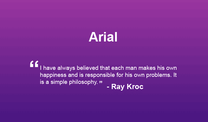
Arial is a popular sans-serif typeface that features natural strokes and open counters to give it a more organic look. Although it is ostensibly a print font, it looks good on web documents as well due to its open design.
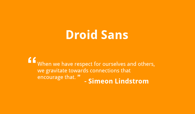
Droid Sans was designed with open counters, tall x-heights, and a sturdy structure to make it highly legible on mobile devices. Like its cousin Open Sans, Droid Sans was designed by Steve Matteson of Ascender Corporation.
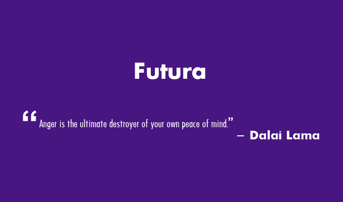
Futura is a classic sans-serif that’s widely beloved for its innovative design and easy legibility. True to its name, it has a futuristic look, but it’s also great for web content.
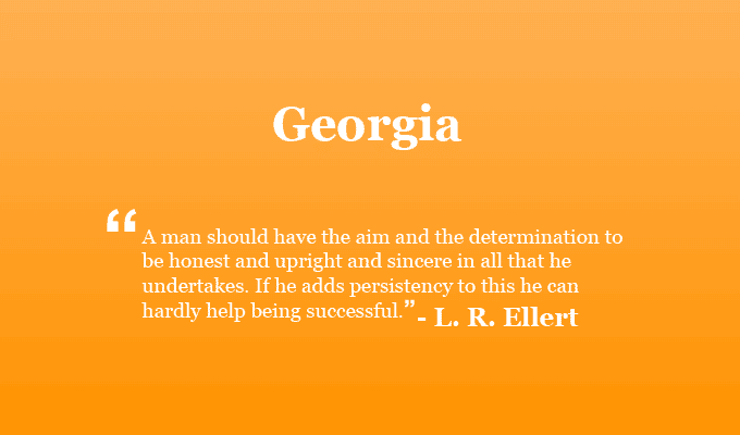
Georgia was actually designed for the Web, especially online documents that would be hard to read otherwise. Georgia remains legible even when reduced to a small font size.
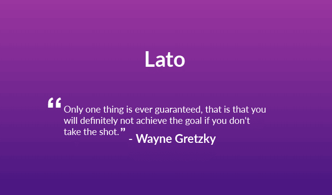
Lato is a Google Font that’s designed for the web. This sans-serif has semi-rounded letters for a friendliness that also looks professional. Thanks to its distinctive yet unobtrusive letter shapes, it’s also highly legible.
This serif typeface was designed to look good on digital documents. It is semi-condensed for an elegant look, yet remains legible at small font sizes.
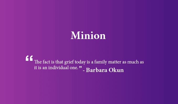
Minion Pro is a distinguished, classic-looking typeface, and indeed it’s an old-school design. Still, its elegance doesn’t detract from its high legibility and smooth rendering on digital devices.
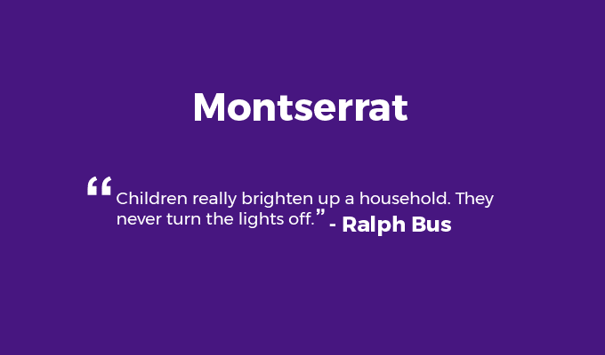
Montserrat is a geometric sans-serif typeface that has an open, friendly yet even and professional look. It’s commonly used as an alternative to the popular font Gotham.
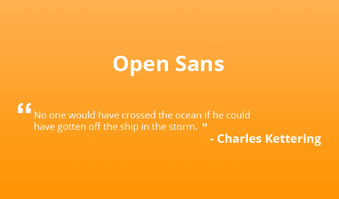
In case you haven’t noticed, a lot of these easy-to-read typefaces are sans serifs. Open Sans was designed by Steve Matteson of Ascender Corp to be an appealing sans serif to suit all designers’ preferences.
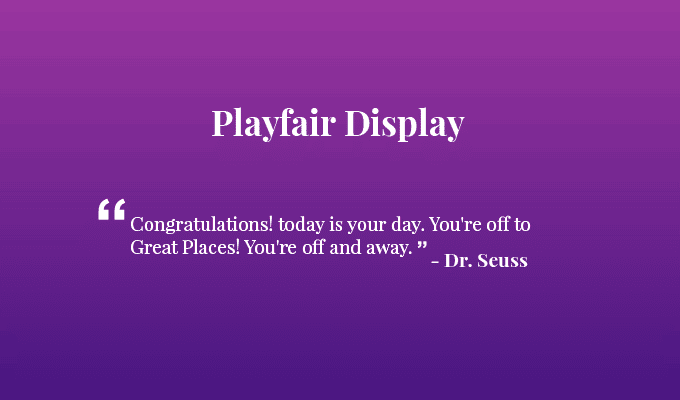
Playfair Display is an attractive serif typeface commonly used for titles and headings. Its tall x-heights and subtle serifs make it easy to read on the web. This open-source font is a great choice for websites that want a distinguished look.
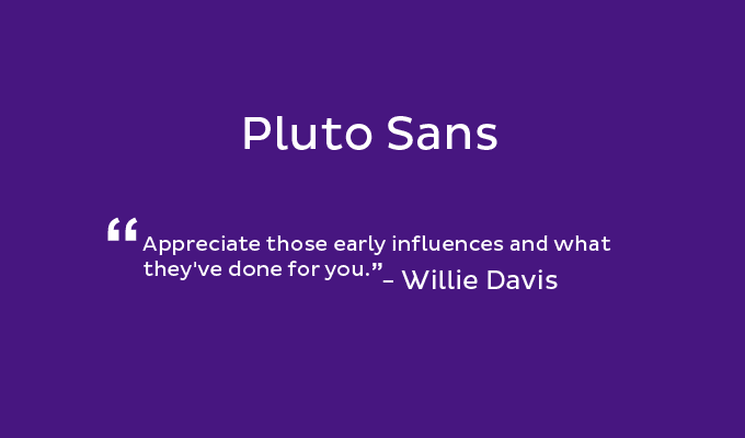
Pluto Sans is a geometric sans-serif designed by Hannes von Döhren in 2012. Its large x-height makes it excellent for rendering long texts, even on the web.
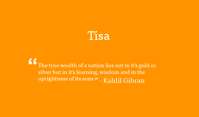
Tisa, designed by Mitja Miklav, looks great no matter where it’s rendered. Its large x-height and ample kerning and counters make it ultra-legible, and it’s a versatile font that looks good in a range of contexts.
This typeface is another one commissioned by the Microsoft Corporation. Designed by Vincent Connare, this sans-serif features tall x-heights and short cross-bars to aid legibility.
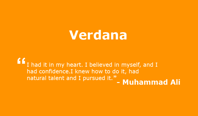
This sans-serif typeface is widely loved for its open counters and distinctive letter shapes, which avoid confusion of “n” with “h,” for example. Created by designer Matthew Carter for Microsoft Corporation, Verdana fonts read very well on websites and digital documents.
See Related: What Is A Lightbox?
Your website is your first line of communication with many of your customers. In addition to great content, you need a typeface that’s highly legible and lets your company’s message shine through. The best web designers know which fonts to choose to match your brand and make your website appealing to visitors.
If you're worried about your website's readability, drop us a line. We can help you figure out how to make your site easier for your audience to read and take action.
—
Thrive Design is a customer-centric web design agency from Seattle. Contact us today to find out how we can elevate your business online! You can find our reviews online at Clutch, UpCity, LinkedIn, and Facebook.
Category: Web design Seattle