

Did you know that, as of 2020, mobile internet usage surpassed internet usage on a desktop? In fact, in 2020, over 55% of website traffic is mobile-based. Here's another fun fact about mobile-based internet usage: users who search for businesses via mobile search are highly motivated to make a purchase.
Sounds great, right? It is good news for small business owners like you unless your website is not optimized for mobile devices.
Search engines and the people who use mobile devices to search for local businesses both prefer mobile-optimized websites. In a recent survey, 91% of consumers said they've turned to a business's competitor if the business's website wasn't optimized for mobile devices. Additionally, a long-standing ranking factor for the Google algorithm is whether a website is mobile optimized.
That means, that if you haven't optimized your website for mobile traffic or invested in a responsive design strategy, you're missing a large audience of motivated potential customers.

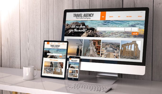
Basically, a website that is optimized for mobile delivers the same high-quality browsing experience to users as it would on a traditional desktop version. Optimizing your website for mobile devices boils down to focusing on simple, clear navigation and content that connects people to what they're looking for.
Now, when you start researching mobile-optimized websites, you will come across a variety of terms that all refer to websites that work the same on mobile as they do on a desktop (responsive design, adaptive design, mobile-first design, or mobile version design). These terms refer to different ways of building a great website for mobile, but the final result is the same: a site that mobile users love to visit.
Read more: What Does Responsive Web Design Mean?

Now that you know what "optimized for mobile" means, let's take a look at some things you can check to make sure that your site has an amazing mobile experience for users.

Website loading speed is important for desktop and mobile versions of your website. Users want to quickly learn about your business and find important information like contact information, product information, and location information. (More about organization in a little bit.)
If your website doesn't load within 3 seconds, nearly half of all visitors will abandon ship to your competitors' sites. One easy way to quickly reduce loading time is to check the image sizes across your site. Resizing can shave off up to 80% of the total image size. For mobile devices, the size of 600-700px is perfect.
There are some user-friendly rules that need to be taken into account when keeping mobile optimization in mind. The first consideration should be the size of your font and assets.
With the smaller screen size, your font should be large enough for people to easily read it without squinting or zooming in. As for your assets, any clickable links or buttons need to be spaced far enough apart that it's easy for users to avoid misclicking and ending up on an unintended page.
Read More: Is a Slow Website Hurting My Google Ranking?

The smaller screen size on mobile devices means that display space is at a premium. When laying out your mobile site, take into account the vertical orientation of the screen and remember that users don't want to scroll side to side when reading content.
Secondly, mobile screens are much less forgiving with distracting visual elements. Images and other large visual assets not only slow down loading speeds but also prevent mobile users from quickly finding the content they came for.
As important as clear and coherent navigation is for a desktop user, it is even more important for your mobile customer. A mobile-friendly website can anticipate your customer's user journey and presents them with their next step in an easy-to-follow manner. If you are unfamiliar with your customer journeys, experiment with Scroll-to-Top widgets, but also seamless sticky headers whenever possible.
With mobile devices ranging from handhelds to tablets, understanding how your site will display on a wide variety of formats is critical. Taking the time to do some testing on the level of mobile optimization on your current website will allow you to make a plan for how to create a compelling mobile experience for your customers going forward.
While solid web design is crucial to a positive user experience, the images and graphics you use in that design are just as important. People are visual creatures, especially when they're browsing the internet. Carefully chosen photos are essential to connecting with and making your customers feel comfortable on your website.
Aside from being a basic web design principle, there are more reasons you want to ensure you have relevant, high-quality images on your website. These design elements are crucial for a solid user experience. (Pro tip: Make sure they are properly sized for responsive design purposes.)

One of the pillars of storytelling is "show, not tell." While this traditionally has been used to encourage writers to use description better, it has a more literal meaning in web design. Your website should "show" through pictures whenever possible.
Words will always be important, especially for conveying any necessary information. But that doesn't mean that people want to be inundated with text when they visit your website. Visual information is not only nicer to look at, it's also easier to process.

Creating an emotional response with your visual elements is a great way to connect with internet users and engage them in your content. Showing how your product solves a problem, creates a difference, or just makes life a little easier is more persuasive than just telling them about how life-changing your product or service can be.

Which is more likely to connect with you: a pool builder telling you about their high-end service or pictures of their amazing builds? A company telling you that their candles are modern and fit in with any decor or pictures showing their candles in use? If you design custom phone cases, your word will not go far unless you can actually show how a specific case looks on a specific smartphone model. Having product photos prominently displayed on your website allows users to easily imagine your product in their space, making them that much more likely to buy.

When you optimize your images with search-friendly metadata and captions creates more content for search engines to index. This metadata and caption information essentially doubles the opportunity for users to find your website through both web searchers and image searches. It's important to ensure your alt tags and titles describe your image and relate to page content to take full advantage of this SEO boost.
The best way to snag attention on a crowded social media platform: great photos. Photos and videos are the ultimate scroll-stopper. Studies show that social media posts with images have higher engagement rates than those with just text. Using the same high-quality photos on your website and in your social content is a great way to bring continuity to these two and increase your online presence.
There are some no-brainers when it comes to choosing photos or graphics to use on your website. You want them to be crisp and clear. You want them to be relevant. You want them to reinforce your brand's color palette. You want them to be sized so that they load quickly, especially for responsive design purposes.

People like to see other people on your website. Bonus points if they are your actual staff or customers. Prominently showcasing real people interacting with your business and product makes your content more relatable to your customers. They want to feel like there's a human element to your website, not just a page of code trying to tell them what they want to hear in order to make a sale.

As important as images are, you need to pick images with a purpose, not just to fill white space or because we're telling you that you need them. The pictures you choose should either show relevant information, prove a point you talk about elsewhere, or convey a feeling that supports your message. When picking images, there are two important questions to ask yourself:
Banner and background images are a great way to fill white space while creating a unique atmosphere on your website and giving your visitors an immediate idea of what your website is about. It's important to take extra care when using background images because they can make your website feel messy. So test those background images with a test audience before launching them.
Adding a personal touch to your website is easy when you customize your photos. Background images are a great way to express yourself and create a unique atmosphere for your visitors. With a little extra care, you can make sure your background images add to the overall design of your website without making it feel cluttered.
Images can support your brand, engage your users, and effectively promote your content throughout your digital properties. Businesses that effectively use images on their website and marketing pieces have a leg up on businesses that struggle to find and use engaging images. Now's a great time to do an audit of the images on your site to see if they're supporting your brand or taking away from the overall user experience.


